7 – Design
Four Principles of Document Design
Kalani Pattison and Nicole Hagstrom-Schmidt
Page design means different things to different people, but here it will mean the use of typography and formatting such as you see in professionally designed documents.
Our focus in this book is technical documentation, which implies modest, functional design.
The following general principles of document design were popularized by Robin Williams in The Non-Designers Design Book, which was first published in 1993 when word processors became more sophisticated and non-designers were more easily able to adjust formatting, layout, and other design choices on printed documents.[1] Williams’s principles of design use an easily remembered acronym: CRAP. These principles are contrast, repetition, alignment, and proximity.
Design trends and choices change over time. Consider the common structure of websites in the past with their sidebars, as compared to the dynamic and vertically arranged blocks common to many websites today. However, these four general principles (CRAP) remain useful guidelines for designing easily readable and attractive documents for both screen and print.
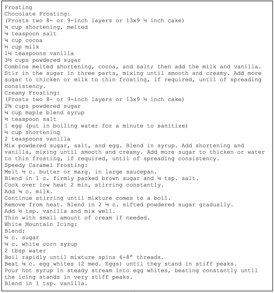
Subsequent sections feature a discussion of Williams’s basic principles, with a few illustrations to demonstrate her points. The following figures (Figures 7.1–7.2 and 7.6–7.8) display the transformation of a collection of recipes for frosting from a difficult-to-read document into a document that is readable, usable, and attractive. Though the example given starting with 7.1[2] is not a traditional professional document, the same principles apply to designing the appearance of professional and technical documents using headings, typefaces, spacing, appropriate color, images, etc.
Contrast
According to the principle of contrast, different elements on a page should be formatted in distinct ways. That is, if things are different, they should be noticeably and obviously different. If elements are formatted differently, but not differently enough, these elements will cause visual conflict rather than contrast. As an example, picture a suit with a jacket and pants that are different shades of black—the jacket and pants will not look as if they belong together. However, black pants and a lighter gray jacket pair more effectively.
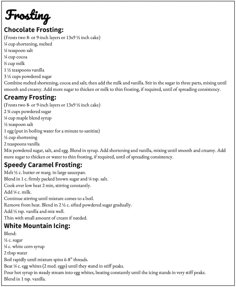
When it comes to a document, contrast can come from contrasting fonts/typefaces, sizes, colors, weight (bolded or unbolded text—the thickness of the lines), position, and alignment. Observe how small additions of contrasting size, font, and weight improve the readability of these recipes in Figure 7.2.[3]
Contrasting Typefaces
As mentioned above, contrasting alignment and color, among other visual factors, are just as important as contrasting fonts, but often design choices need to start with what your letters look like. For text to be contrasting in size, there should be a minimum of 4 points difference. Contrasting size 10 and size 12 font usually offers more conflict than contrast. A key place you might see this type of contrast is in a résumé where the applicant’s name appears in size 16 font, but the remainder of the document is in size 12.
The best way to contrast font or typeface choices is to use contrasting types of fonts. The difference between typeface and fonts is that a typeface includes all of the related versions of a font—Arial, Arial Bold, and Arial Italics are all different fonts of the typeface “Arial.” There are three major kinds of typefaces: serif, sans serif, and display.[4] Generally speaking, a single document shouldn’t use more than one of each type. Including a display font/typeface is usually optional.
Serif typefaces have little feet/tails. These extra strokes are called “serifs.” Figure 7.3[5] shows a few strong examples of Serif typefaces.

Serif typefaces (often called “fonts” in word processing software) are best used for body text and printed documents, especially when text stretches across a page.
Sans serif typefaces do NOT have (are without or sans) feet/tails. Figure 7.4[6] shows some strong examples of Sans Serif fonts.

These typefaces are best used for headings, short lines of text, text displayed on a projector (e.g. PowerPoint, Google Slides, etc.), some advertisements, and text on webpages. Sans serif fonts tend to look more clean and clear.
Display typefaces are fancy typefaces meant for titles, advertisements, or name brands. Figure 7.5[7] shows a few particular examples of display typefaces.

These typefaces are best used for titles or headings, if they are used at all. They are often more difficult to read, and they are more effectively used to establish branding than to communicate significant content.
Other Contrast Opportunities
In addition to typeface, the clarity and attractiveness of documents can be improved by paying attention to contrast in spacing, in color choices, and in any other areas where opportunities present themselves. For instance, having a contrasting amount of space after paragraphs and after headings helps the headings to stand out from the body text. Contrast in vertical alignments (a different kind of spacing) can help lists to stand out in clearer ways as well. Contrast in color is important when putting text on a colored background—while black on white reads easily, it is also sometimes too much contrast for people reading on screens. However, black on a dark blue background also would be difficult to read. As red/green color-blindness is relatively common, designers should avoid contrasting shades of red and green. Changing the letters of headings to a dark color distinguishable from black is one way to add contrast between headings and body text and give documents a little extra attractiveness, while keeping the document formal.
Repetition
Just as different elements need different formats, similar elements need similar formats. Repetition is the concept for providing visual consistency across a document. For example, if a Level 2 heading is formatted in a specific way—size, weight, font/typeface—then every Level 2 heading needs to be formatted in that same way. Likewise, every time there is a bulleted list, the bullets should be in the same style.
Repetition is primarily about consistency. In addition to similar elements repeating the same formatting, if there are added design elements such as rules (the proper term for lines), images, or other visual components, they should repeat elements of design from elsewhere on the page. For instance, a color choice in a heading for text might repeat a color found in a photograph. If illustrations are provided, they should all be in the same style.
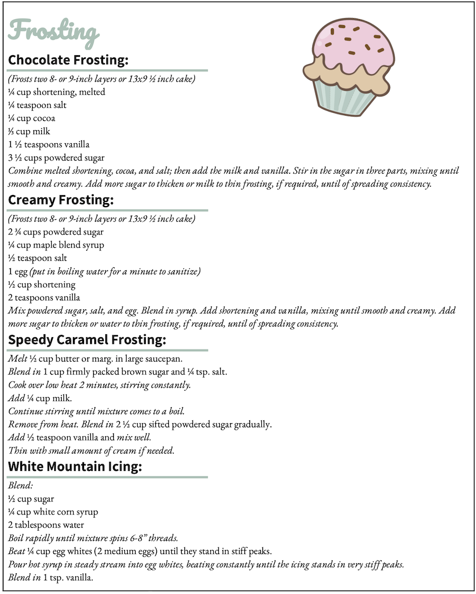
In the following example, Figure 7.6[8], measurements have been revised to use consistent terminology and abbreviations, directions have been repeatedly italicized to further provide contrast between instructions and ingredients, and some colors and added design elements have provided other instances of repetition. [9]
Alignment
Alignment consists of both the visible and invisible lines that connect different objects on a page. If the text is all left aligned (as above in Figure 7.6), then the eye makes an invisible vertical line down the front of the text near the margin. Both text and other elements on a page need to be aligned with at least one other element.
Alignment provides structure for a page and influences how a reader approaches the information presented; it also influences the order in which information is examined. Alignment also communicates the hierarchy of ideas presented on a page. Typically, the most general or most important information is presented either centered (as in a title) or furthest to the left margin (in left-to-right-oriented writing systems). As text is aligned further to the right (that is, indented or tabbed), it indicates that it is a more specific part of the general system introduced or is less essential information. To visualize an example of this concept, think of a standard outline. Major topics for a section or paragraph are aligned further to the left, while sub-topics and evidence are placed underneath the main points and indented further to the right.
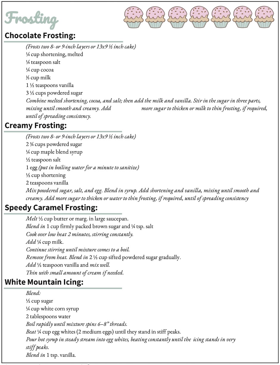
Contrast can also be applied to a document’s alignment to make a document more “skimmable.” Keeping consistent alignment and applying alignment to other elements help to keep a page visually unified. Examine how these principles applied to the recipes in Figure 7.7[10] contribute positively to the appearance and readability of the document by clarifying the recipe titles and aligning the cupcakes more clearly and attractively with other textual elements.
Proximity
The final principle of document design—proximity—means making sure elements that are more closely related to each other conceptually are more closely positioned to each other on the page.
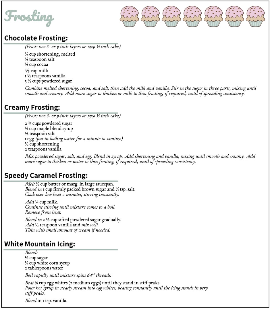
This principle doesn’t mean that you need to reorganize everything on the page so that, for instance, all of the ingredients in the recipes document are together, as the contents follow other organizational principles (in this case, division/partition and then chronological order). What good proximity does mean, however, is that similar pieces of information should be close to each other and set off from different types of information by white space. Headings should be closer to the text/paragraphs they describe than to previous text. In the case of the following recipes, adding space between different recipes and different types of steps/information within the recipes, allows the reader to more easily follow the steps provided (Figure 7.8[11]).
The Four Principles in Technical and Professional Documents
These figures above have given examples in formatting and design as applied to a somewhat more informal document. However, the four principles of contrast, repetition, alignment, and proximity apply just as much in more formal reports, correspondence, and application materials. Things as simple as font choice and size, space between paragraphs, etc. are design choices — even if you just go with the default settings of your word processor. Professional documents often use premade designs set by organizations’ conventions and branding. However, when writing application materials, working for a small business, designing webpages, or writing types of documents not often used at an organization or company, it is important to make conscious design choices in order to convey professional ethos.
- Robin Williams, The Non-Designer’s Design Book, 4th Ed. (Berkeley, California: Peachpit Press, 2014). ↵
- Kalani Pattison, “Example of Difficult-to-Read Document,” 2020. This image is licensed under a Creative Commons Attribution-NonCommercial-ShareAlike 4.0 International License. ↵
- Kalani Pattison, “Contrast Example,” 2020. This image is licensed under a Creative Commons Attribution-NonCommercial-ShareAlike 4.0 International License. ↵
- These three types are deliberately simplified to help you understand how to choose appropriate fonts and typefaces for strong document design. For more information on ways of classifying fonts, typefaces, differences in use, history of typefaces, etc. see “Fontology,” Fonts: Learning, accessed August 14, 2020, https://www.fonts.com/content/learning/fontology. ↵
- Kalani Pattison, “Examples of Serif Typefaces,” 2022. This image is licensed under a Creative Commons Attribution-NonCommercial-ShareAlike 4.0 International License. ↵
- Kalani Pattison, “Examples of Sans Serif Typefaces,” 2022. This image is licensed under a Creative Commons Attribution-NonCommercial-ShareAlike 4.0 International License. ↵
- Kalani Pattison, “Examples of Display Typefaces,” 2022. This image is licensed under a Creative Commons Attribution-NonCommercial-ShareAlike 4.0 International License. ↵
- Kalani Pattison, “Repetition Example,” 2020. This image is licensed under a Creative Commons Attribution-NonCommercial-ShareAlike 4.0 International License. This image incorporates the following: Arousaland, “Hand Drawn Cupcake.” Wikimedia Commons, October 15, 2018, https://commons.wikimedia.org/wiki/File:Cupcake-icon.svg. This item is made available under a CC0 1.0 Universal Public Domain Dedication. ↵
- Arousaland, "Hand Drawn Cupcake." Wikimedia Commons, October 15, 2018, https://commons.wikimedia.org/wiki/File:Cupcake-icon.svg. This item is made available under a CC0 1.0 Universal Public Domain Dedication. ↵
- Kalani Pattison, “Alignment Example,” 2020. This image is licensed under a Creative Commons Attribution-NonCommercial-ShareAlike 4.0 International License. This image incorporates the following: Arousaland, “Hand Drawn Cupcake.” Wikimedia Commons, October 15, 2018, https://commons.wikimedia.org/wiki/File:Cupcake-icon.svg. This item is made available under a CC0 1.0 Universal Public Domain Dedication. ↵
- Kalani Pattison, “Proximity Example,” 2020. This image is licensed under a Creative Commons Attribution-NonCommercial-ShareAlike 4.0 International License. This image incorporates the following: Arousaland, “Hand Drawn Cupcake.” Wikimedia Commons, October 15, 2018, https://commons.wikimedia.org/wiki/File:Cupcake-icon.svg. This item is made available under a CC0 1.0 Universal Public Domain Dedication. ↵
Arrangement of visual elements such as columns, typography, and graphics on a page.
Design principle where components of a document are formatted differently to visually reinforce relationships between sections, including the hierarchical importance of information.
Technique of providing information in words or visuals again and again.
Principle of graphic design where elements, such as graphics and text blocks, are lined up, either by the edge of the element or through an invisible center line through the elements.
Design concept that states that elements more closely related to each other conceptually are more closely positioned to each other on the page.
