Designing Documents
Stacey Corbitt
Chapter Overview
Apicius, a Roman foodie of the first century, said “We eat first with our eyes.” Information, not unlike food, must appeal visually to a reader immediately if it is to have a fighting chance of being understood and used. Readers decide whether to “consume” documents in a similar way to how people decide whether to consume a meal. Eating documents first with the eyes means readers rely on a document’s formatting as a means of indicating readability. Therefore, it is critical that writers use the available tools discussed in this chapter to optimize readability: if the document is not appetizing at first glance, readers may ignore or avoid it altogether.
In similar ways as illustration is a powerful visual tool for technical writers, attending to the graphic or visual design of documents critically affects an audience’s ability to understand and use those documents. Keep in mind that technical documents must be clear, complete, concise, and correct in order to succeed in their purpose. The audience and purpose must be a writer’s primary considerations in making design decisions.
The explanations, examples, and exercises in this chapter aim to help students learn how to use principles known to appeal to human visual perception through development of these skills:
- To make decisions about document design according to the SCRAP design principles
- To use page design features deliberately with the purpose and readers’ needs in mind
- To be mindful of reasons to use and change fonts (including sizes and styles)
- To practice using titles and headings in most academic and professional writing
What are the SCRAP design principles?
Typical lessons about document design principles include most of the same principles, presented in some variation on the SCRAP* acronym used in this chapter. For purposes of this fundamentals and introductory technical writing text, the following principles are explored:
- Size The size of an element on a page indicates importance of the element
- Contrast Use color and high variations in shade to draw the reader’s attention
- Repetition Pattern consistency among headings/other elements shows relationships
- Alignment Consistently lined up items on a page connect in a reader’s mind
- Proximity Readers see elements placed close together as being related in meaning
* The same principles may also be represented by the acronyms CARPS or CRAPS.
What page design elements matter for purpose clarity and reader success?
Clarify the purpose
The writer’s purpose for creating a document is often the clearest path to take in answering the question above. Why are you creating your document? Keep in mind the answer is never one of these:
- Because I need to get a good grade on an assignment
- Because it’s in the syllabus
- I don’t know
While a writing assignment may be the starting point for you in creating a document, it is never the purpose of the document. Similarly, without knowing the goals a piece of writing must accomplish, there is no way to judge whether the document was a success or failure. Therefore, the purpose of your document must be clear to you. Why are you creating your document?
- To persuade my audience
- To entertain my audience
- To inform my audience
- ?
Can you think of another purpose for a document that might not fit into one of the general purposes listed above? Discuss with a classmate and, if so, write that purpose below:
Identify the audience
Finally, the audience for whom a document is intended must determine the ultimate effectiveness of a piece of writing in achieving its purpose. When a writer’s specific purpose for developing a document is known, it is possible the makeup of the audience may also be specific. However, the intended audience may be comprised of people representing a range of ages, interests, socioeconomic and educational backgrounds who also have varying degrees of knowledge and beliefs about your topic. For this reason, it is always a best practice to analyze an audience early and often as you make decisions about design elements.
Activity: Analyze an example to identify its purpose and its audience
Review and discuss the following US Dept. of Labor poster (2012) with your classmates as directed by your instructor. Answer the questions and be prepared to discuss in class.
https://www.osha.gov/Publications/3231_Teen_Poster.pdf
What do you think is the primary purpose of the example document? How do you know?
Who is the primary target audience for the document? Be as specific as possible regarding as many characteristics of the audience as you can.
The five design principles of SCRAP may not always apply to every document you create: nevertheless, as a careful technical writer you should consider each of the principles as you try various methods of developing documents that reach your defined audience in ways that successfully achieve the purpose of your message.
Size of an element indicates importance of the element
Consider the way a relatively new type of image – the word cloud – demonstrates how size may indicate importance.

The word cloud is a visual representation of the frequency or importance of terms contained in a digital discussion or document. In this instance, it presents an easy visual representation of how size demonstrates importance of an element in a document. What stands out in the sample illustration as being important? Discuss with your classmates what may be the subject of the discussion represented by the word cloud above.
Contrast draws attention
Documents employ white space on a page in order to increase the contrast between the “empty” space on a page and the text or other elements. In other words, what is “not there” can focus a reader’s attention precisely where the writer wants the attention: for example, what would you read first on the following page examples? What do the pages represent (even though you cannot “read” them) simply based upon the contrast your eyes can identify?
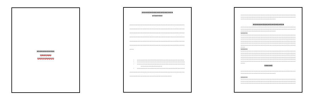
A word of caution: take care not to overuse contrast on a single page. You may find it works best when drawing attention to a single element.
Repetition of patterns creates connections throughout a document
For example, using elements like text boxes with a color to present exercises, or bulleted lists for all summaries, can be a strong signal to readers. If all examples appear in the same format with the same colors and fonts, readers can immediately recognize there is a relationship among those elements that bear the same characteristics.
Working with a peer in class, look at one of your other course textbooks and try to identify a visual pattern that is easy to spot as you compare two chapters to each other. Can you determine that the two chapters have one or more sections that bear the same heading? For example, is there a section in each chapter called “Chapter Summary” or something similar?
Discuss with your partner what features those sections or elements have in common across both chapters. The repetition of things like font style and size, colors, graphics or shapes, and headings all work to make the document (chapter) cohesive within itself and connected to the other chapters through consistency of design.
Alignment makes the organization of a page obvious
Closely related to repetition of page design features is alignment, which reinforces the relationships among items in a text that are primary, equal, and subordinate. Alignment is most evident in professional writing through the use of bulleted or numbered lists on a page; and numbered sections in a document. If you look back at the miniature images of pages in the Contrast section, you can probably identify titles, main section headings, subsection headings, bulleted lists, and plain text. These elements are easier to discern and place in relationship to other elements largely because of their alignment, or levels of indentation from the left margin.
Proximity clarifies the big picture
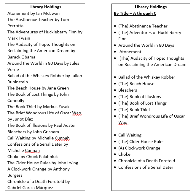
Readers typically see items as closely related to each other when they appear in close proximity to one another. At a minimum, it is important to use proximity as a design tool to prevent confusion that can occur when closely related elements are not clearly visually connected. For example, compare the two lists on the following page. Which example shows items closely connected in a way that is helpful to your understanding? What, if anything, on the next page may create confusion for a reader?
The significance of proximity for enforcing connections while minimizing confusion is also demonstrated in the “Integrating Graphics” chapter of this textbook. Specifically, illustrations are good examples of elements that necessarily have proximity requirements. In the event as a reader you find illustrations that confuse rather than clarify, ask the following questions about the proximity of the related elements to each other:
- Are the signal phrases obvious in the text immediately preceding the illustration? Avoid placing these two items more than a fraction of a page apart in the document.
- Are the captions attached to, and appearing on the same page as, the graphic elements?
At this point you may recognize that all the principles of SCRAP overlap with and influence each other. Do not be concerned if you have trouble discerning, for example, repetition from alignment as you employ those strategies in your own documents. These five principles work in different combinations to focus your writing to assist readers in understanding and fully responding to your work.
What are the rules and considerations for choosing font sizes and styles?
In a way that is similar to the “little goes a long way” advice about using contrast, deliberate yet subtle changes in the size and style of text are essential in developing superb technical documents. Consider the American Psychological Association’s (APA’s) direction in Section 2.19 of the Style Manual – Seventh Edition (2019) indicates APA-style student papers may be written in sans serif fonts (like Arial or Calibri) or serif fonts (like Times New Roman or Georgia) with variations only in specific instances.
Discuss the use of different fonts with your peers in class. In the past, what kinds of choices have you made in your use of fonts in various types of writing? Why do you think APA does not provide for more creative changes in its guide?
Keep in mind that, particularly in technical writing, you will have many opportunities to use illustrations and other interesting visual elements that are not generally part of typical essay-style college writing. In other words, strive for clear, easy-to-read text presented in a standard font at a readable – but not distracting – size. The words you write should always convey the meaning and the message of your document and should not distract readers or raise questions about items unrelated to that message.
Are titles and headings really necessary for most documents?
Chances are you learned limited uses for and information about elements like section headings and subheadings in high school courses. Understandably, your instructors needed to focus on making sure you and your classmates had adequate practice with skills like grammar, mechanics, sentence structure, and paragraph development to get you ready for post-secondary education. Now that you are writing at a college level in preparation for a professional career, attention to the elements and aspects of technical writing style is warranted.
Recall what you learned in the early chapters of this textbook about technical writing’s characteristics. Technical writing is clear and concise: it does not employ overly complex words or excessively long sentences. Technical writing is accessible, in part because it avoids long paragraphs while striving to be complete and correct by including relevant details. In order to achieve its goals, technical writing relies specifically on descriptive titles and consistent, useful signposts within documents, typically in the form of headings. Correspondence, both in the common forms of 1) personal and formal letters; and 2) business emails and memos; is the main exception to the “titles” rule, but correspondence can benefit from section headings as well.
Chapter conclusion
The only way a writer can ensure an audience will use his or her document for its intended purpose is by designing that document as an appealing and highly usable instrument. Elements of design discussed in this chapter include size, contrast, repetition, alignment, and proximity (SCRAPS). Technical writing demands attention to design, including but not limited to SCRAPS.
Homework
- Locate a poorly designed document that does not align with the SCRAP design principles.
- Prepare an APA-style reference entry for the document.
- Write a memo to your instructor explaining the design issues you identified in the original document: include in-text citations. Create figures if applicable.
- Summarize the changes you would make to help bring the document in line with the design principles you have studied here, and provide a rationale for your design choices.
References
American Psychological Association (2020). APA style. https://apastyle.apa.org/style-grammar-guidelines/paper-format/font
United States Department of Labor (2012). Poster image: I have rights. https://www.osha.gov/Publications/3231_Teen_Poster.pdf
Wiley, D. 2011, October 10. “Word cloud” is licensed under CC-BY- 2.0 https://www.flickr.com/photos/davidwiley/6296834006/
